
Today marks a new chapter for Noloco.
We’re unveiling a fresh visual identity — one that reflects the true power of our platform and the direction we’re heading. This is more than just a new logo or a new coat of paint. It’s a redefinition of who we are, what we’ve built, and where we’re going next.
Why We’re Rebranding
Noloco has evolved. What started in 2021 as a way to help teams build internal tools without code has grown into a powerful platform for creating full-featured apps — and more recently, a platform infused with AI that power thousands of people’s work, each and every day.
As our product matured, our brand stayed behind. The old identity was certainly helped us get to where we we are, but it no longer reflects the strength, trust, and velocity of Noloco today.
This rebrand is about aligning our look and feel with the platform our customers already know and love — and the one we’re continuing to improve.
What’s New
We’ve redesigned everything — with intention.
A new logo
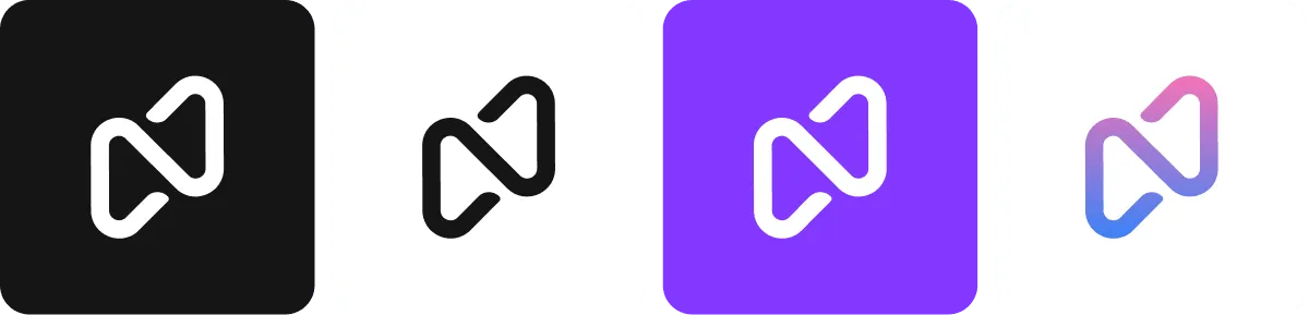
Our new wordmark and icon mark a clean break from the past. The icon is a subtle nod to a paperclip: a simple, dependable tool that connects things — just like Noloco.
A new color palette
Moving away from bright, playful tones to a more refined, confident, and accessible palette.
A brand new website
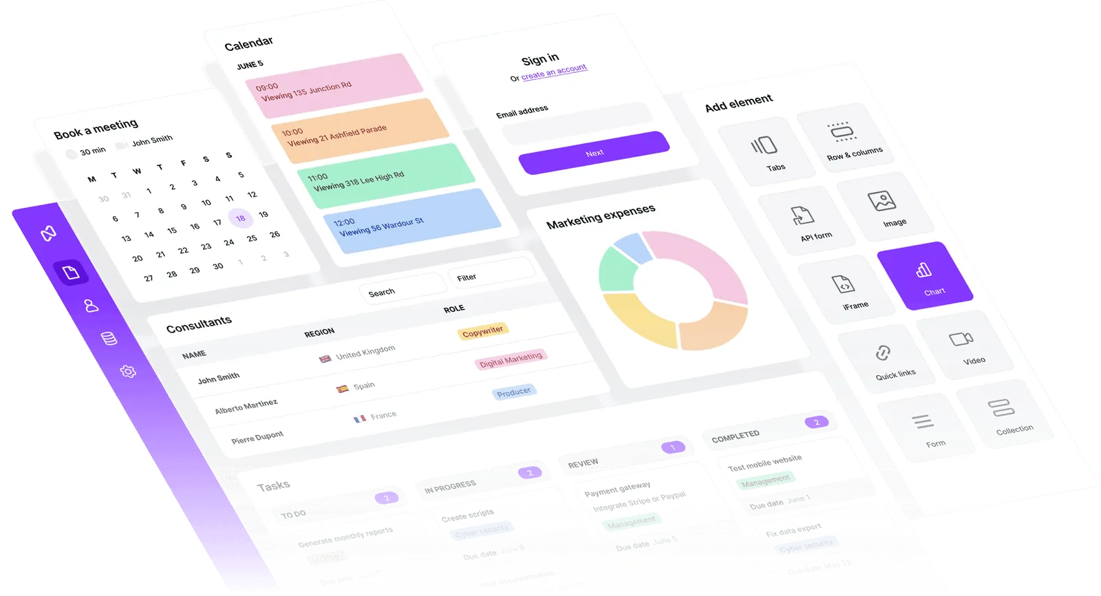
Our new site is not only better organized, but it now reflects the breadth & power of what you can build with Noloco.
The Meaning Behind the Design
While there’s no complex symbolism behind every pixel, our new identity was shaped by clarity and intent. The paperclip-inspired logo speaks to how Noloco connects the building blocks of modern apps. It’s a tool you trust — something dependable, efficient, and surprisingly powerful in its simplicity.
We want our brand to feel like our product: intuitive, robust, and built for the future.
Looking Ahead
This rebrand isn’t the finish line — it’s the starting point.
Later this year, we’ll be rolling out some of the biggest updates in Noloco’s history.
AI is becoming deeply integrated into the platform — powering workflows, helping teams move faster, and making app-building easier and smarter than ever. Our new look sets the tone for that future.
We’re building Noloco not just for what no-code was — but for what AI-powered software development can become.
– Darragh
Founder, Noloco

Written by
Darragh Mc Kay
Founder and CEO at Noloco
Darragh is the founder and CEO of Noloco, a platform that empowers teams to build powerful internal tools and customer portals without writing code. With a background in software engineering, he brings a sharp product focus to everything he does—balancing deep technical understanding with a passion for intuitive user experiences. On the blog, Darragh writes about building and scaling SaaS products, no-code development, startup operations, and using AI to accelerate product development.