EnterprisePricing
Custom Charts & Dashboards
Build Custom Charts & Dashboards
for Data Visualization
Visualize your data in real-time and turn complex
information into easy-to-read visuals.
information into easy-to-read visuals.
No credit card required
Make your data easier on the eyes
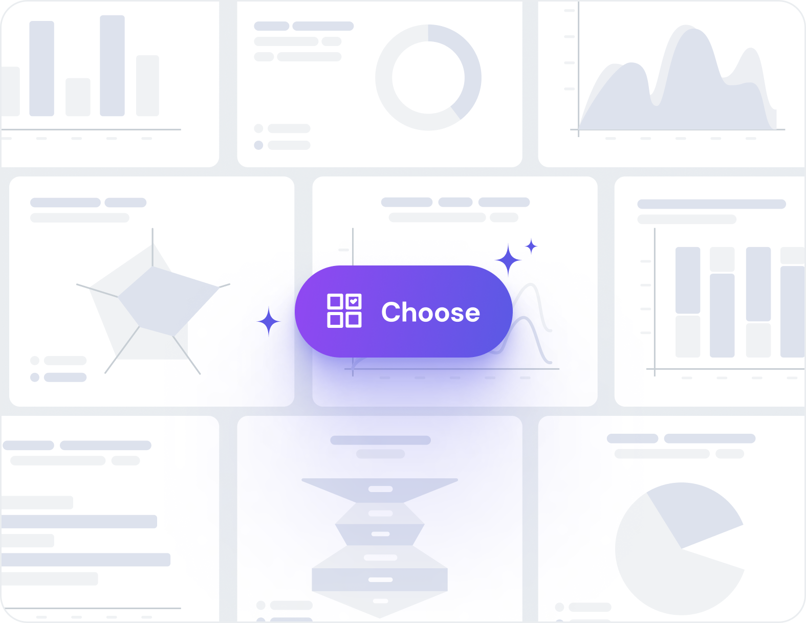
Chart selection
Choose from a
wide range of charts
Pick from a variety of chart options, including bar, area, line, funnel, radar, and pie charts—it’s completely up to you!

Dashboard creation
Create dashboards
with multiple charts
Combine multiple charts on a single page, apply dynamic filters across your entire dashboard, and give users the power to explore data their way. Customize chart layouts to perfectly match your design vision.
Data display
Display only the
data you choose
Easily pick which data from your collection to show on the X and Y axis. You can also create data visibility rules for which charts each user should be able to see.


Chart configuration
Customize your charts
Add multiple data series, group records by time periods, and define precise chart and axis titles—all through a simple, user-friendly interface that puts powerful visualization tools at your fingertips
Advanced data visualization made effortless
These customers had great things
to say about Noloco Charts
RE Cost Seg
A custom Client Portal & CRM for managing Real Estate Cost Segregation
GAP Consulting
A tailored project management system & client portal for streamlined project delivery and real-time collaboration
PFE Limited
A custom reporting solution for bespoke Engineering analysis
Create your first chart and let the results speak for themselves
Gain instant insights and make data-driven
decisions—with confidence!
decisions—with confidence!
No credit card required